From Fields to Fast Lanes: The Village Organic Kitchen Story
Overview:
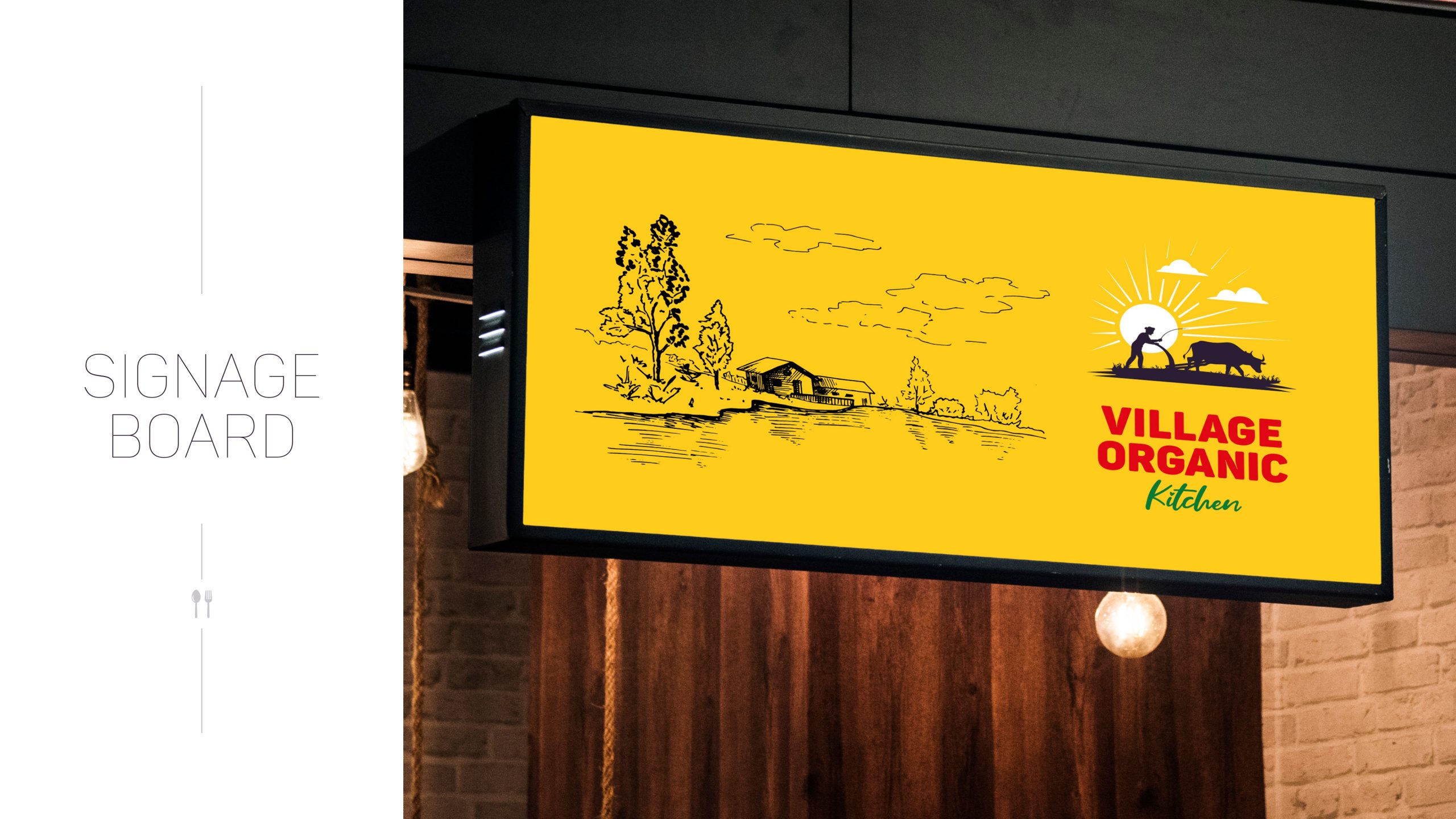
Village Organic Kitchen is a farm-to-highway dining concept that brings authentic, millet-based, and organic meals to travelers on NH65. With outlets placed on one of India’s busiest highways, the brand needed a visual identity that was both memorable at 100 km/h and true to its earthy, traditional values.
The Challenge:
– Create a brand that is instantly recognizable from a distance – Blend rural identity with modern attention-grabbing visuals – Reflect the brand’s philosophy of farm-fresh, chemical-free food – Enable the brand to stand out among fast-paced highway signboards
The Design Thinking
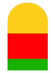
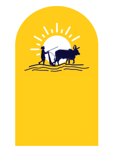
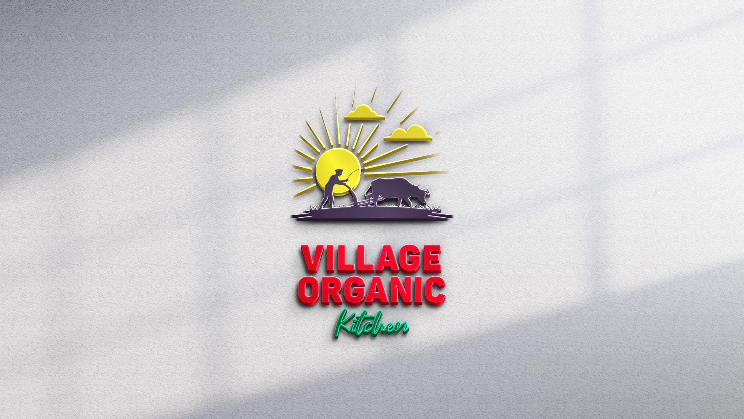
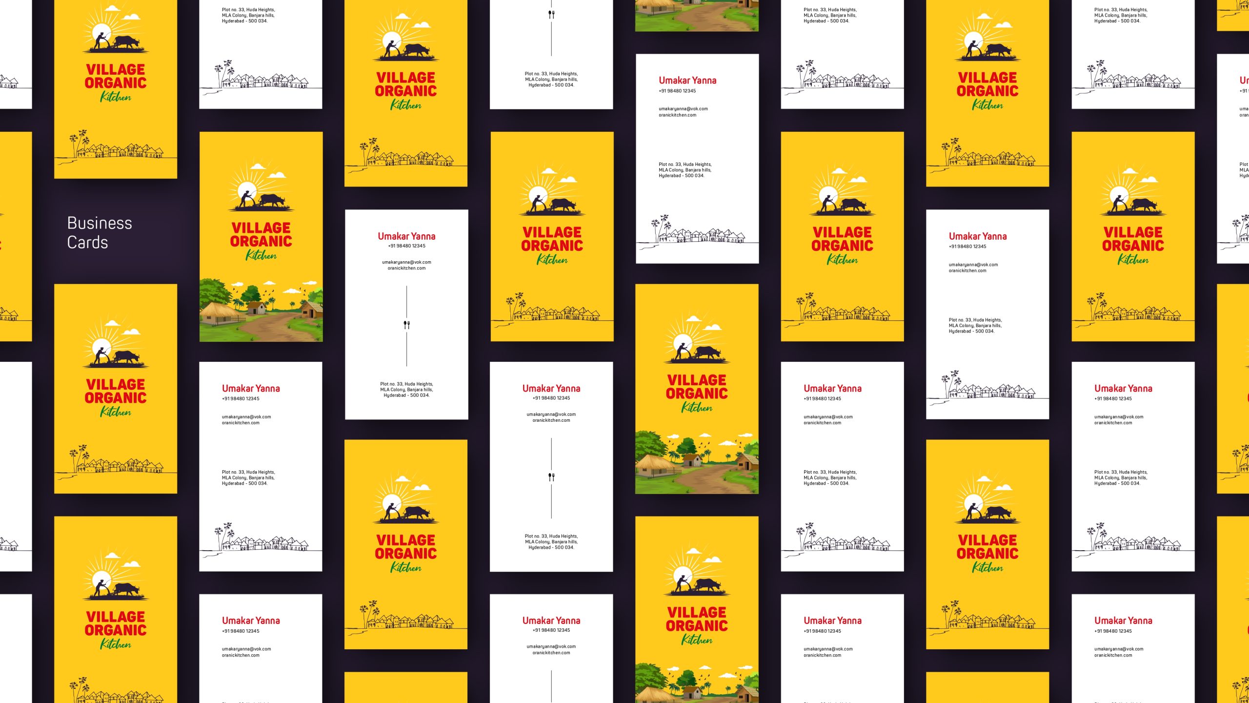
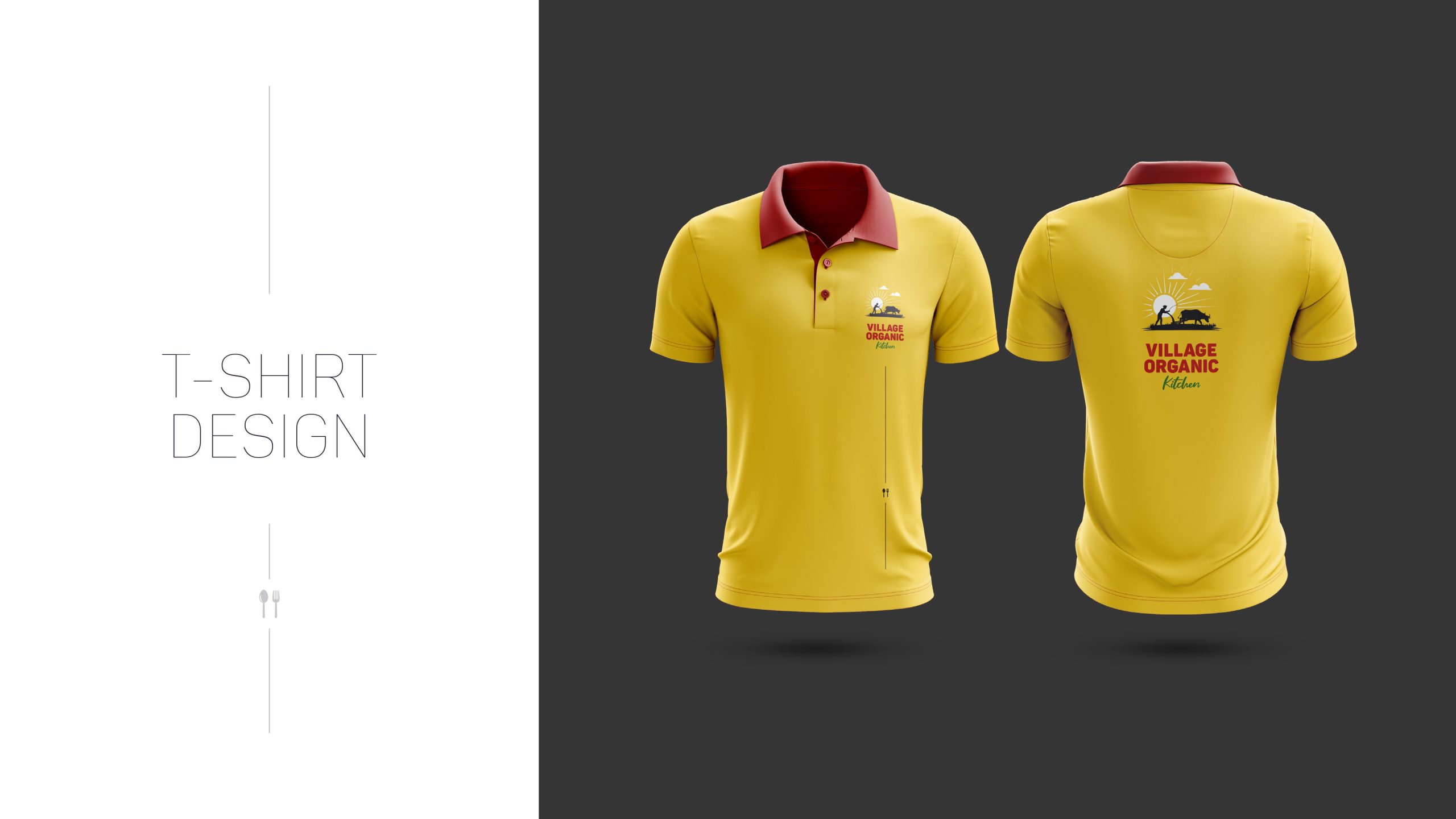
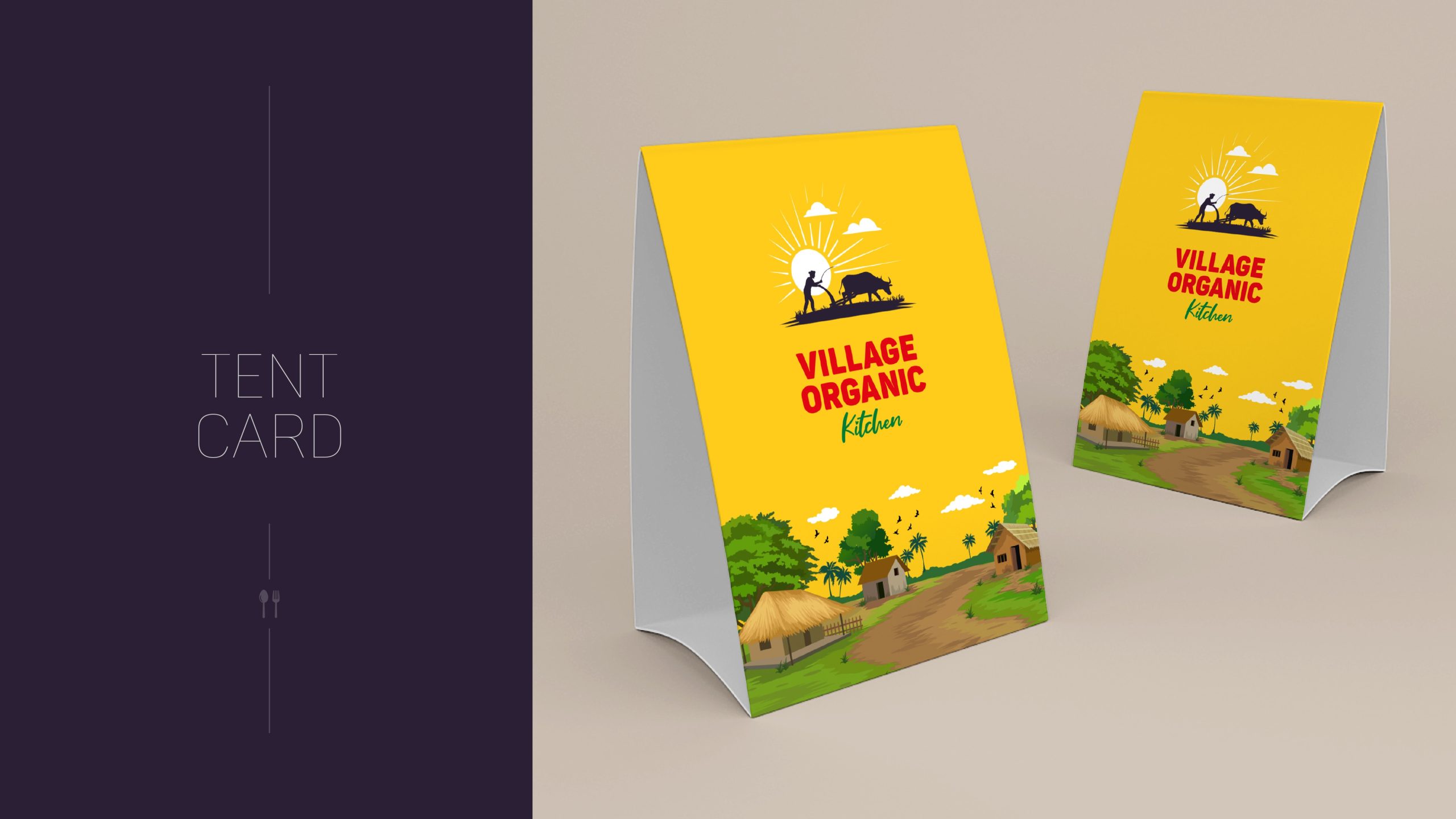
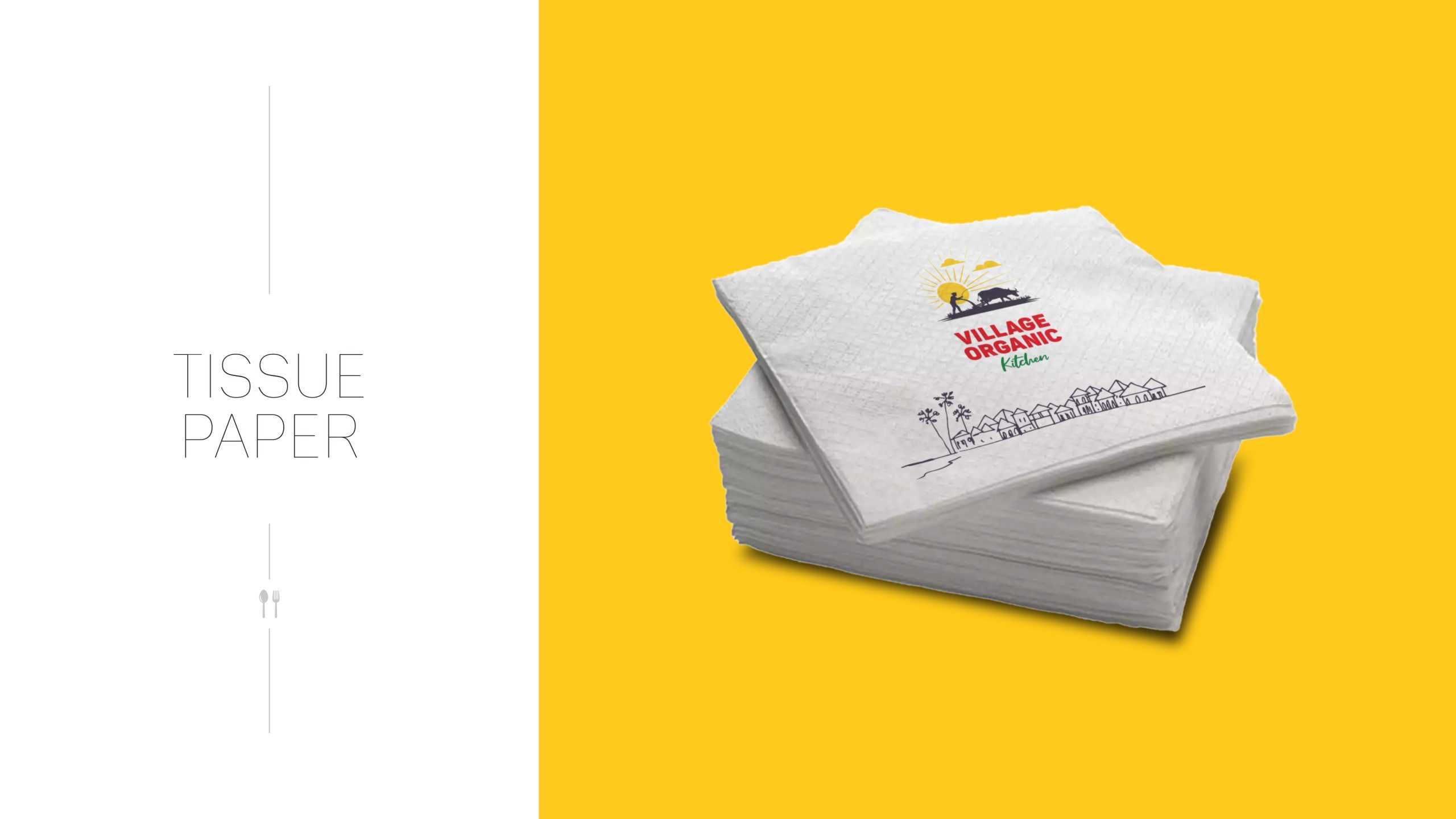
Logo as a Milestone:
The logo was intentionally shaped like a highway milestone, triggering recognition and trust among travelers.
It acts as a subconscious indicator of “rest” or “replenishment.”
Color Palette That Cuts Through Speed:
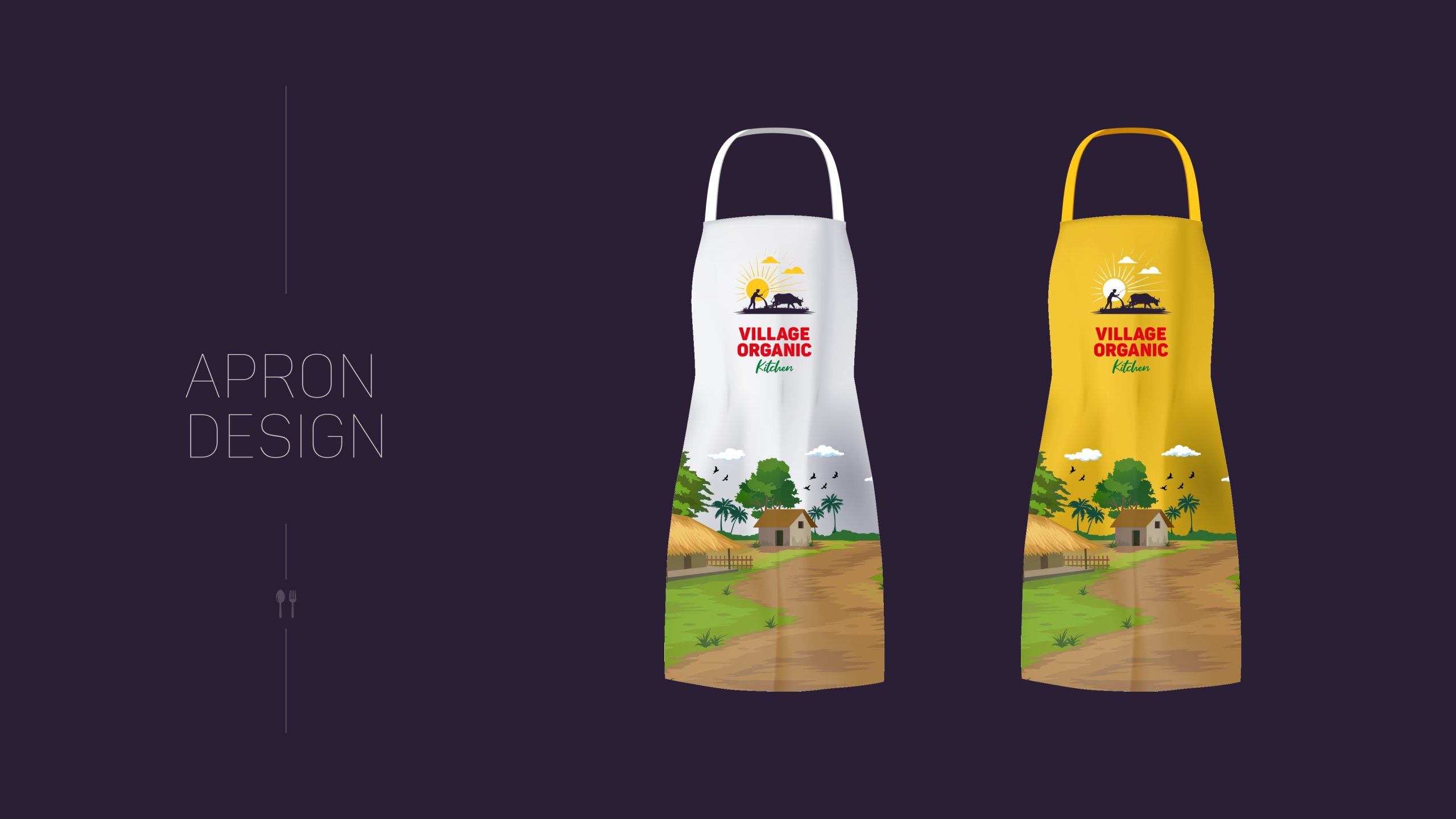
– Sun Yellow: Symbolizes warmth, nourishment, and grabs attention at high speeds – Bold Red: Activates hunger and urgency – ideal for quick decision-making – Green Accents: Emphasize health, organic roots, and natural freshness
Visual Storytelling:
– Farmer and bull iconography communicates authenticity andrural values – Rising sun suggests hope, energy, and a new start.