Minimalist aesthetics meet rich brews in an intimate space.
Overview:
Nestled in a green courtyard oasis, The Cour Cafeis a boutique cafe concept that blends sustainability with sophistication. They approached Gridto develop a brand identity that would reflect their eco-conscious values, serene ambiance, and upscale yet approachable vibe.
The Challenge:
The Cour Cafe needed a brand identity that could:
Evoke a connection to nature and calmness
Feel premium but remain friendly
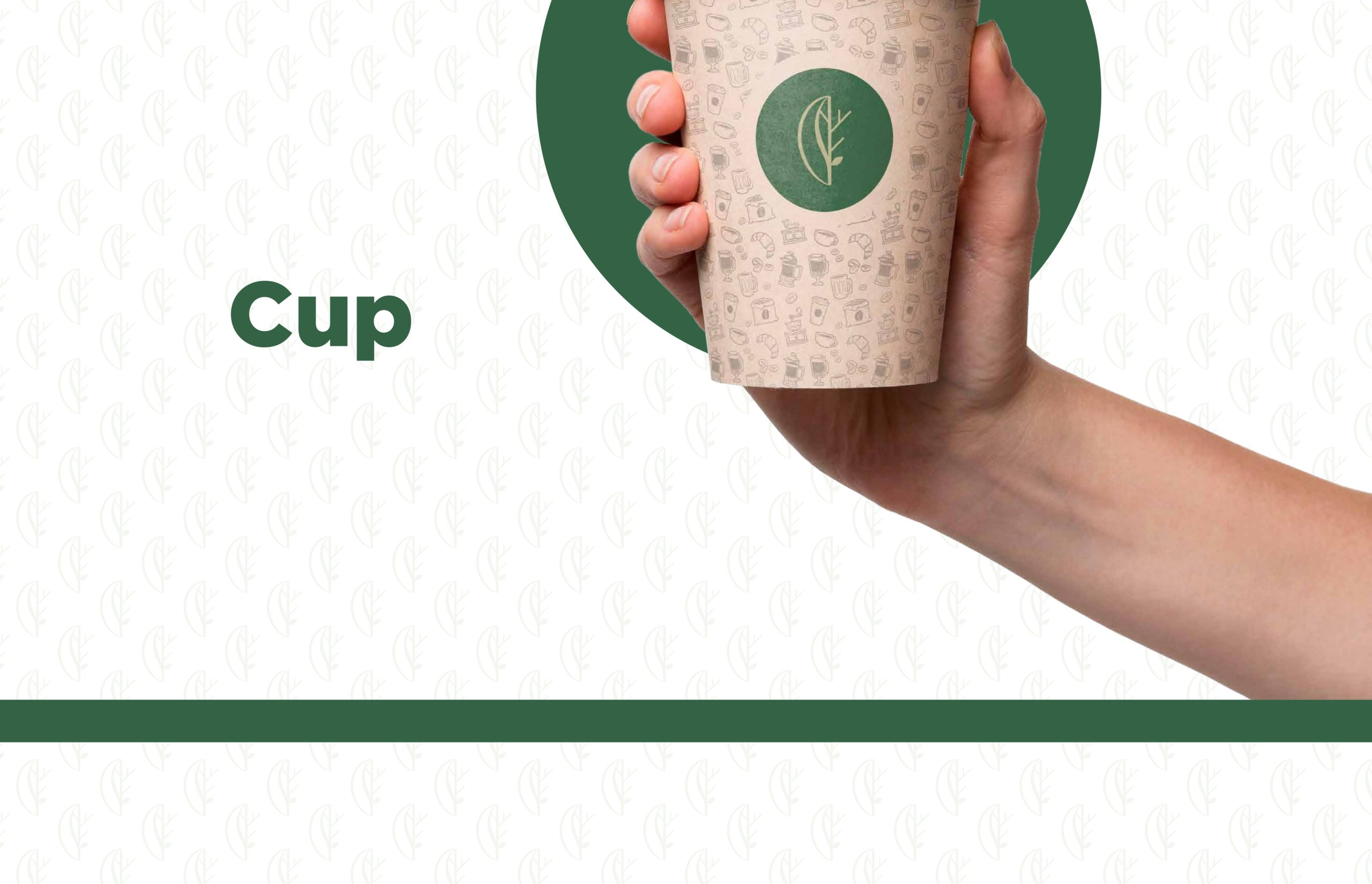
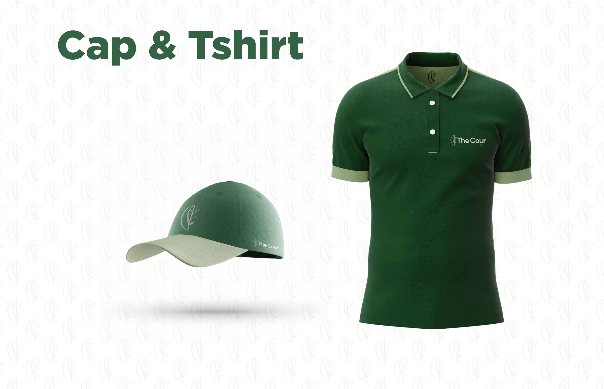
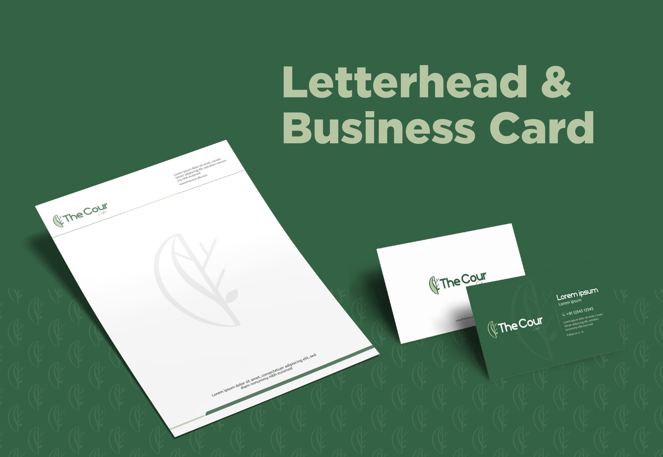
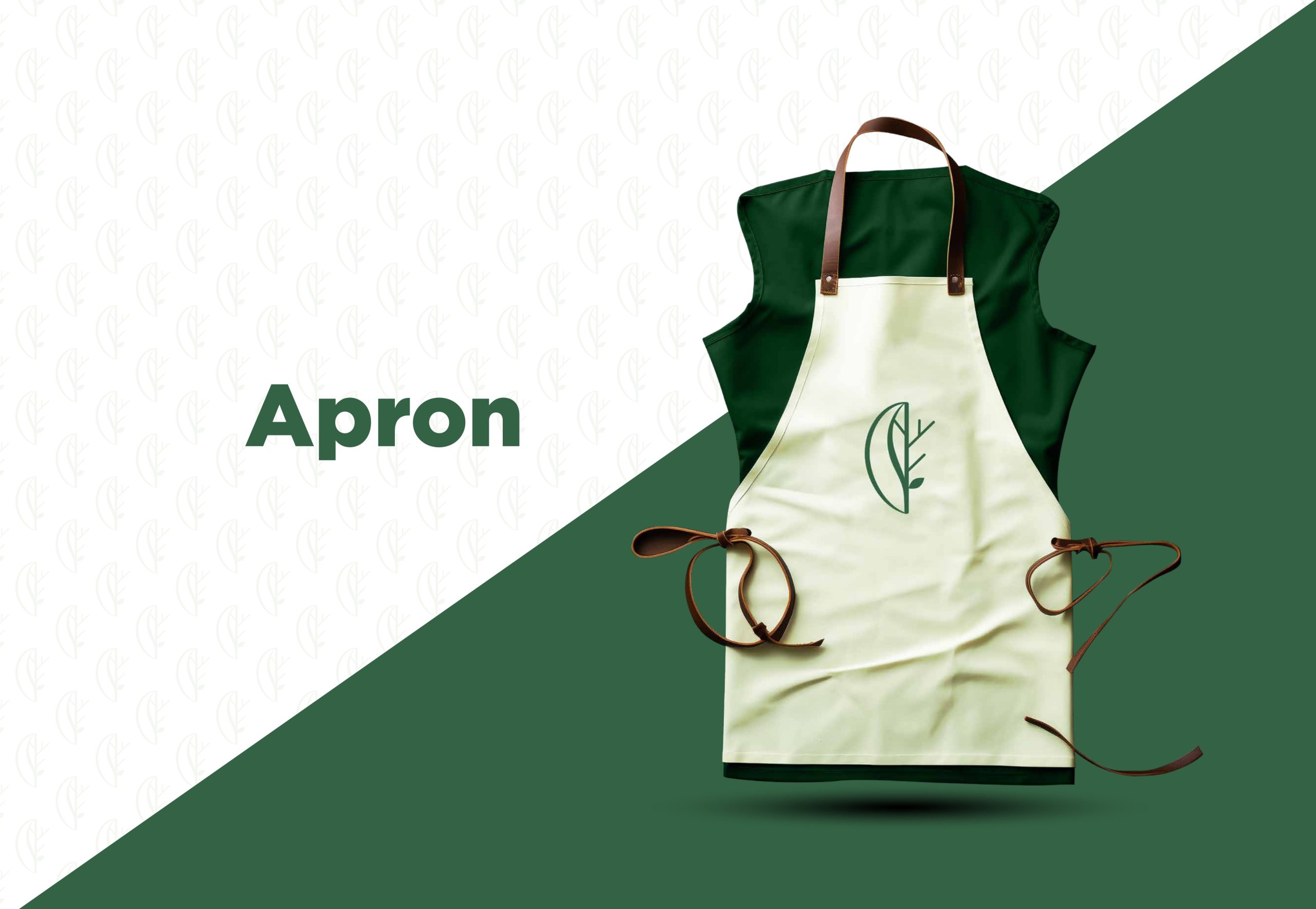
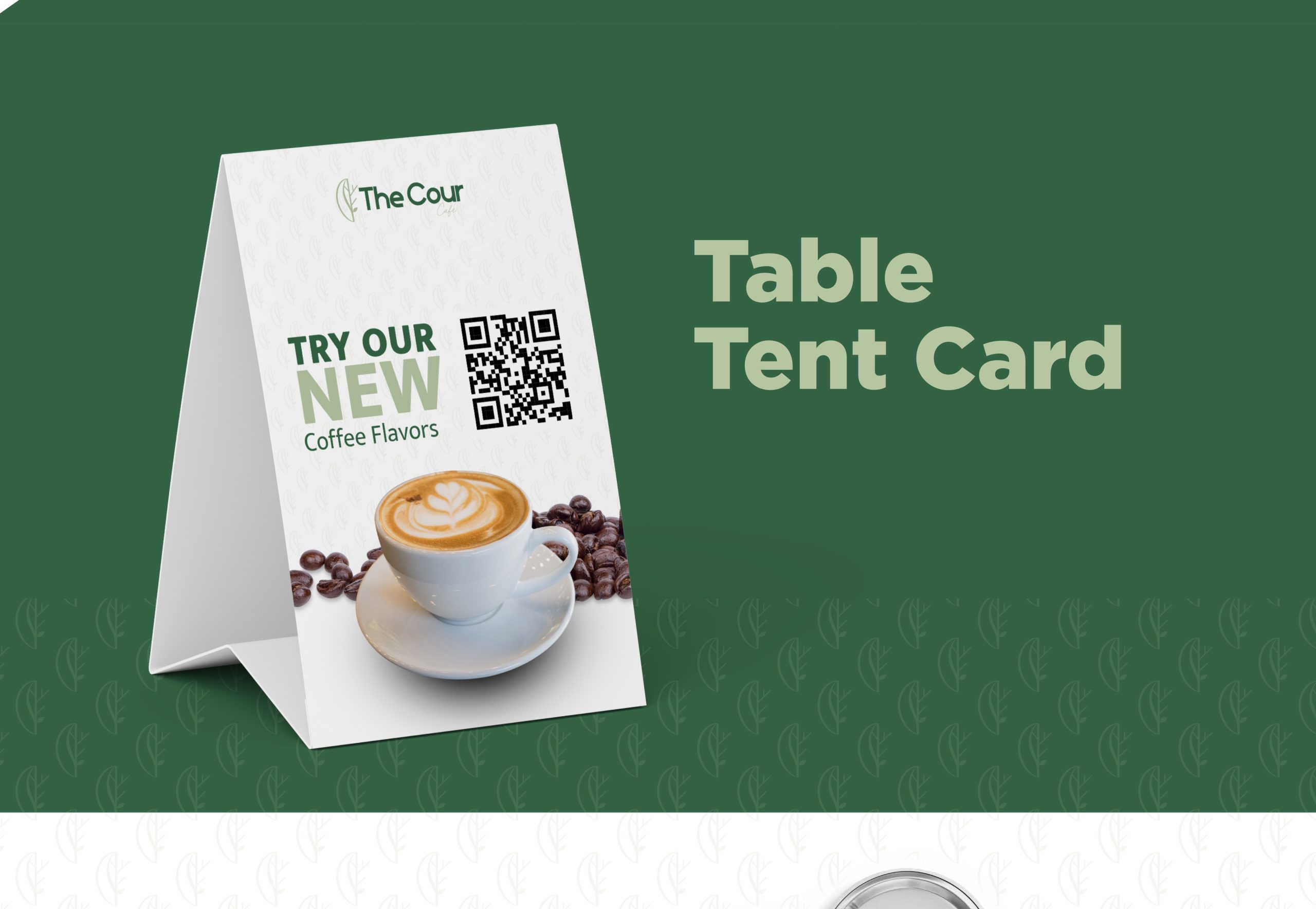
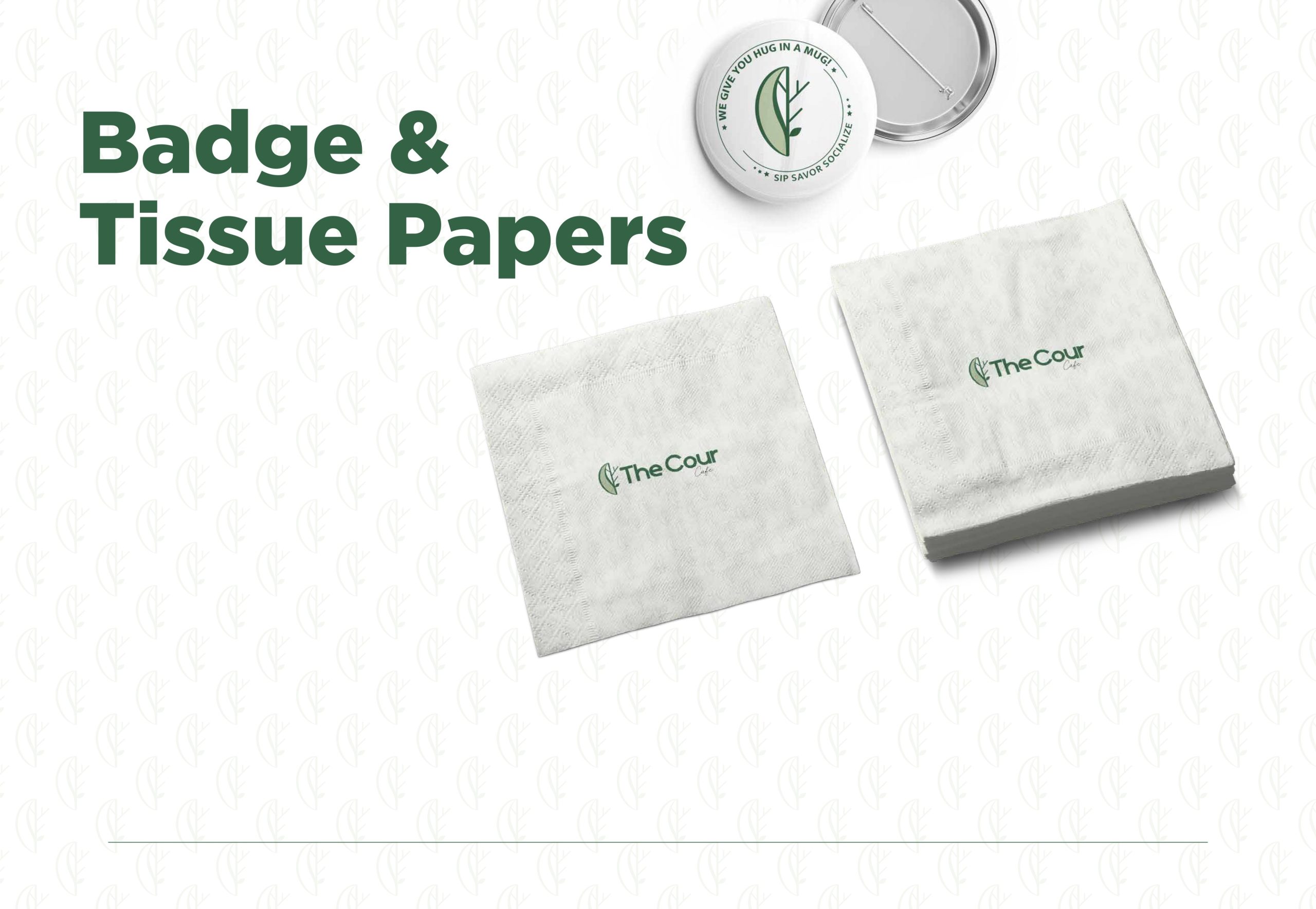
Work seamlessly across digital, print, and physical applications (from menus to signage)
The Design Thinking
Strategy:
We grounded the brand in three pillars:
Organic Forms – to represent nature and sustainability
Modern Simplicity – for a clean, upscale aesthetic
Approachable Elegance – balancing professionalism with warmth
The Logo:
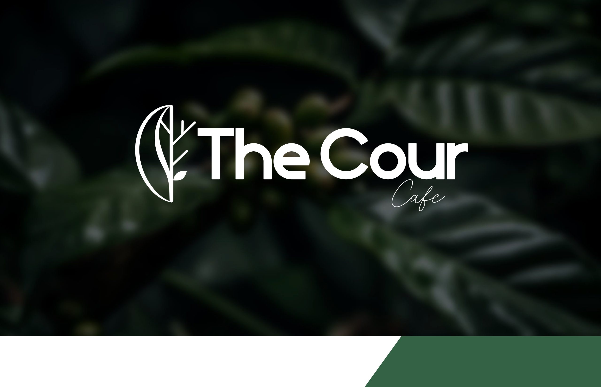
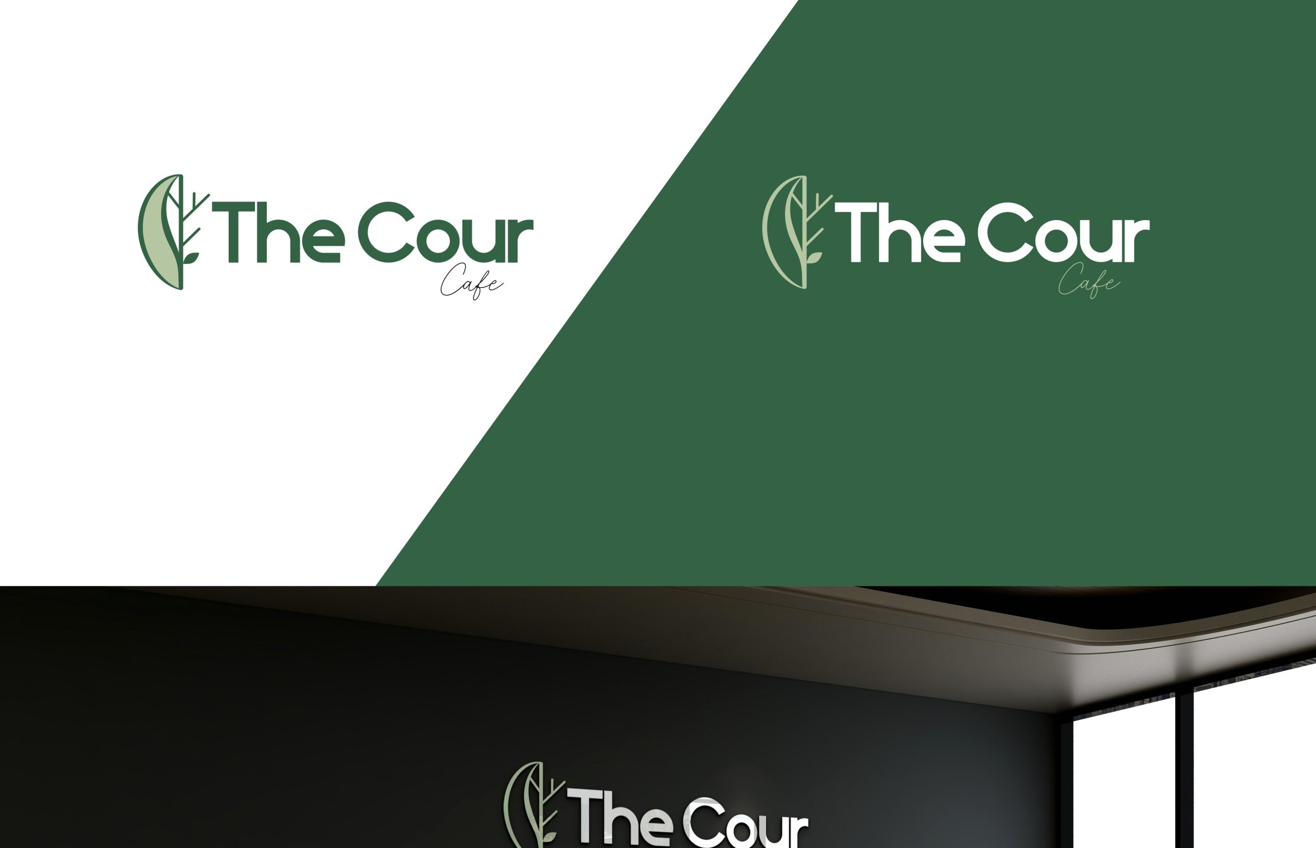
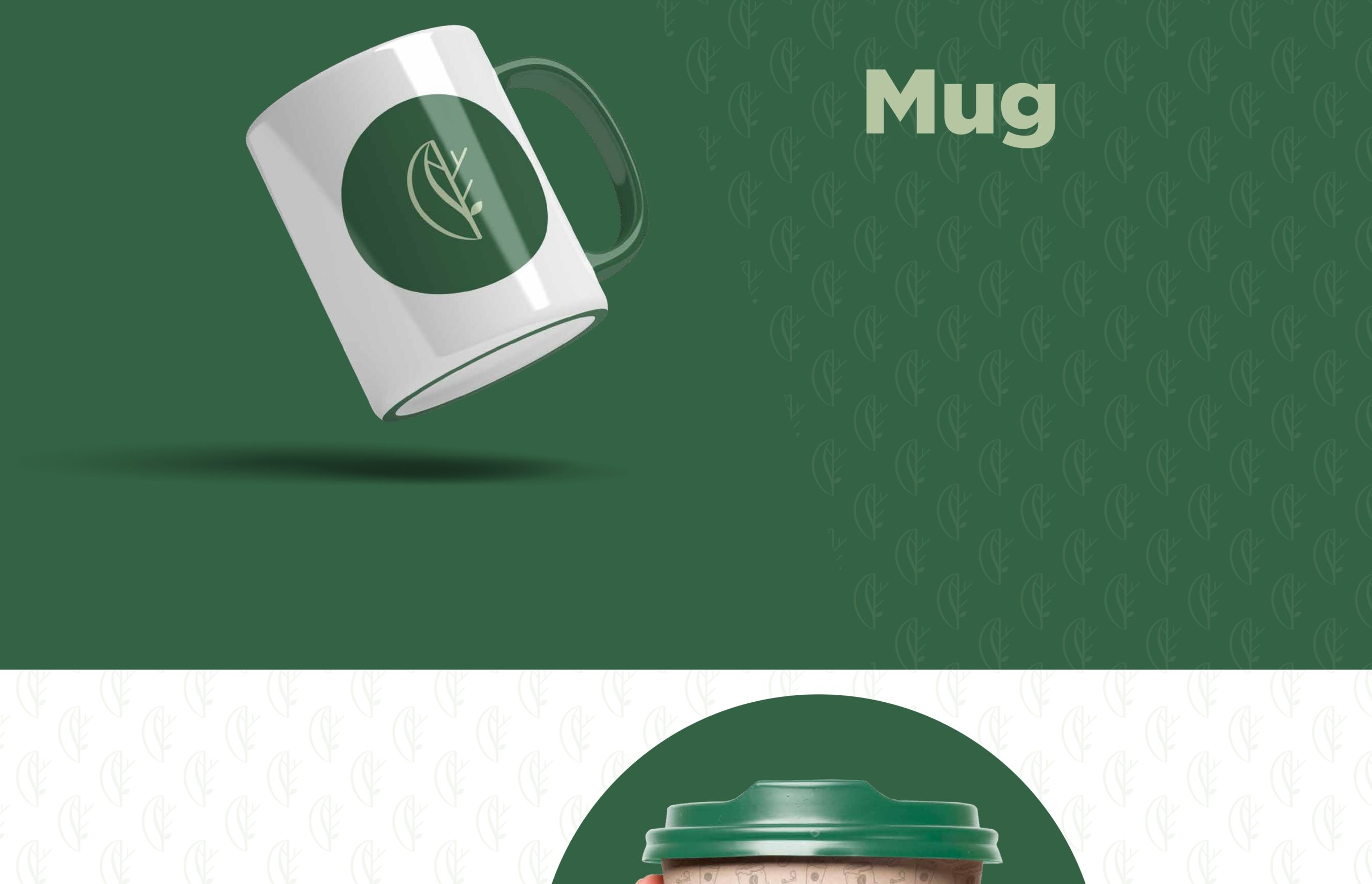
The logo features a stylized monoline leaf and tree symbol nested in a curved frame, forming a subtle “C” for Cour.The leaf integrates with minimalist branches, creating a unified natural mark. The typography uses a geometric sans-serif for “The Cour” paired with an elegant handwritten script for “Cafe”, achieving a perfect blend of structure and flow.
Color Palette:
A grounded palette of natural greens and soft neutrals was developed, inspired by foliage and earthy tones. It communicates calmness and environmental consciousness.